
Sero
Sero Focus is a screen time app for iPhone. To open a blocked app early you play a short game instead of tapping past a dialog, and an emergency unlock is still there when you need it.
- Own product, co‑founded
- Co‑founder. Product, features and design
- Two co-founders: me on product and design, Almaz Kussainov on engineering
- iOS
- 2026
Blocked until
18:592h 18m left
1 running • 6 apps blocked
Daily average
3h 37m
↓ 18% vs previous week
Pickups
130
↓ 9% vs previous week
Social media
Until 18:59
Discover · Problem
Leaving a focus app takes one tap
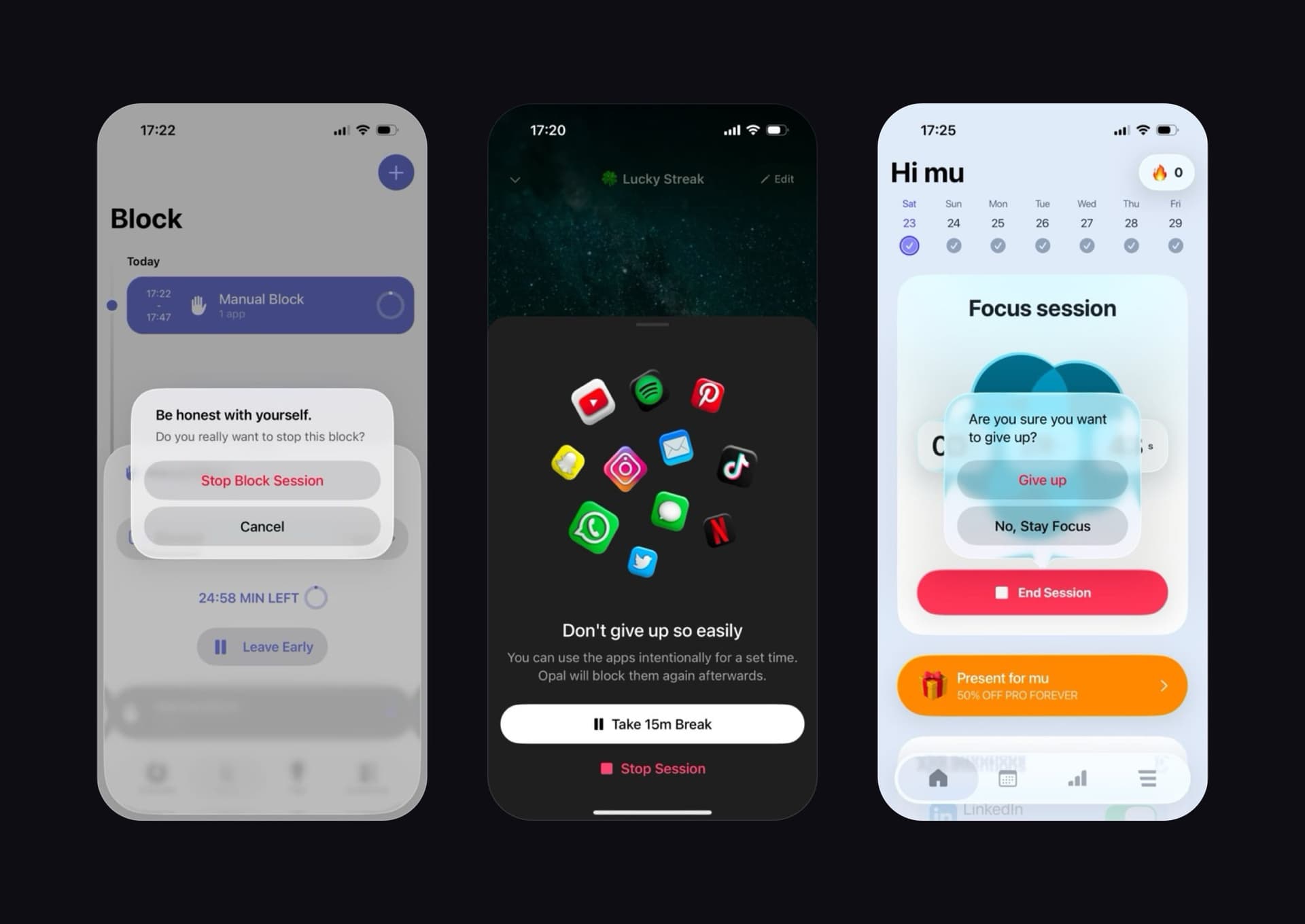
I went through the moment five focus apps let you out: Opal, ScreenZen, Refocus and two others. Each one asks if you're sure, and lets the copy do the arguing: "Be honest with yourself." "Don't give up so easily." "Are you sure you want to give up?" The button to leave sits right under the question. After a few days you stop reading it.
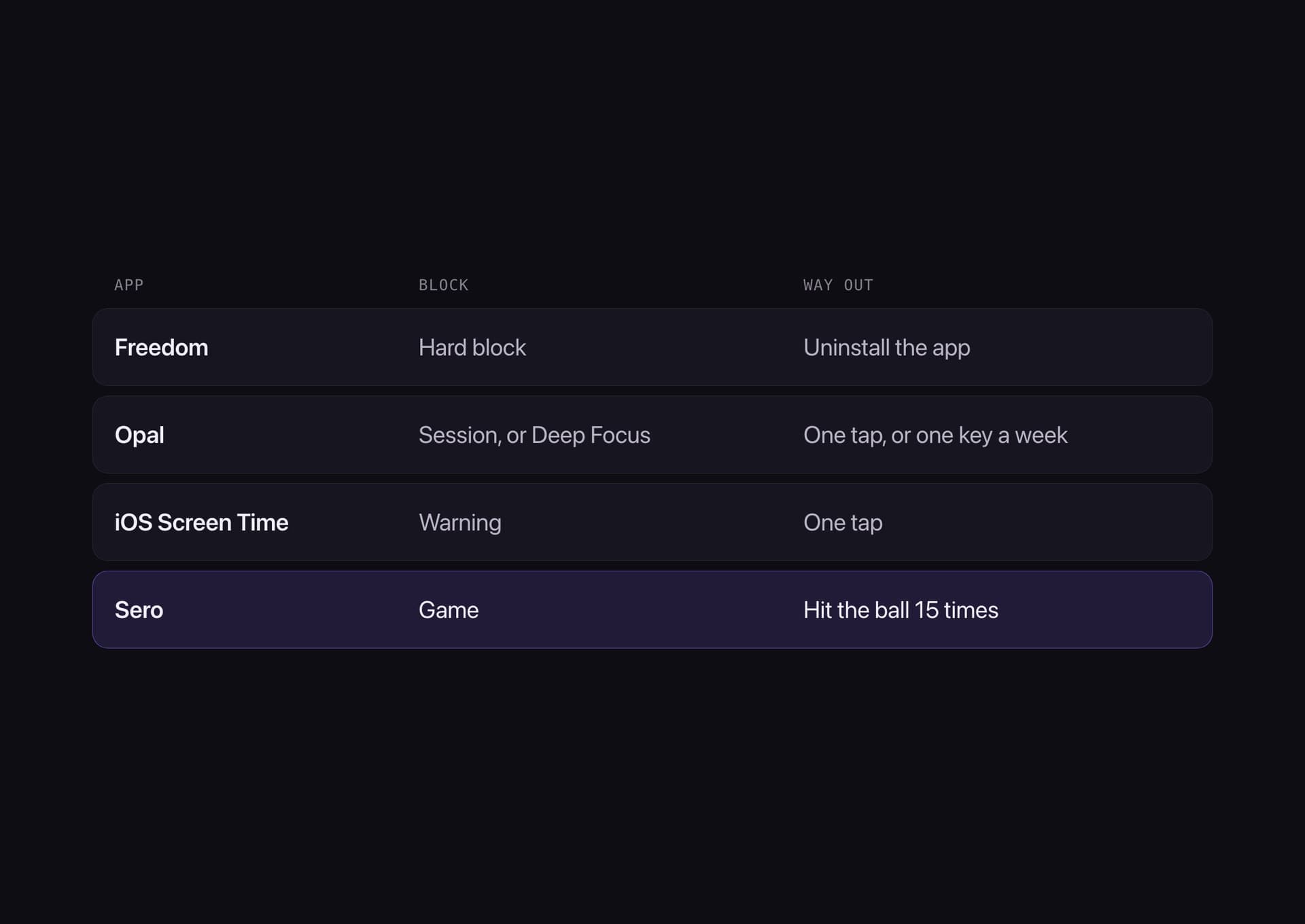
The strict modes fail the other way. Opal's Deep Focus has no way out except one emergency key a week, and testers told me what that leads to: "I just deleted it when I got annoyed." "I'd override it immediately, it felt pointless."
Develop · Mechanic
A game where the dialog used to be
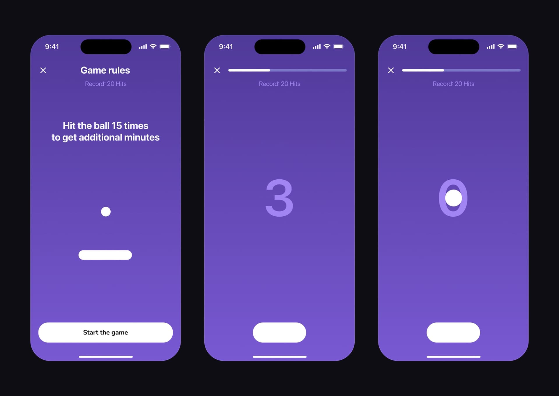
I wanted leaving to cost a few seconds and a little attention, not willpower. Open a blocked app and Sero shows one rule on a purple screen: hit the ball 15 times. A countdown, then the game, with a bar on top that fills with every hit. Finish and the app opens for 15 minutes.
The screen is one line, one ball and one paddle, with the ✕ still in the corner. The emergency unlock is always there: one a day on Free, three on Premium.
Develop · Visual language
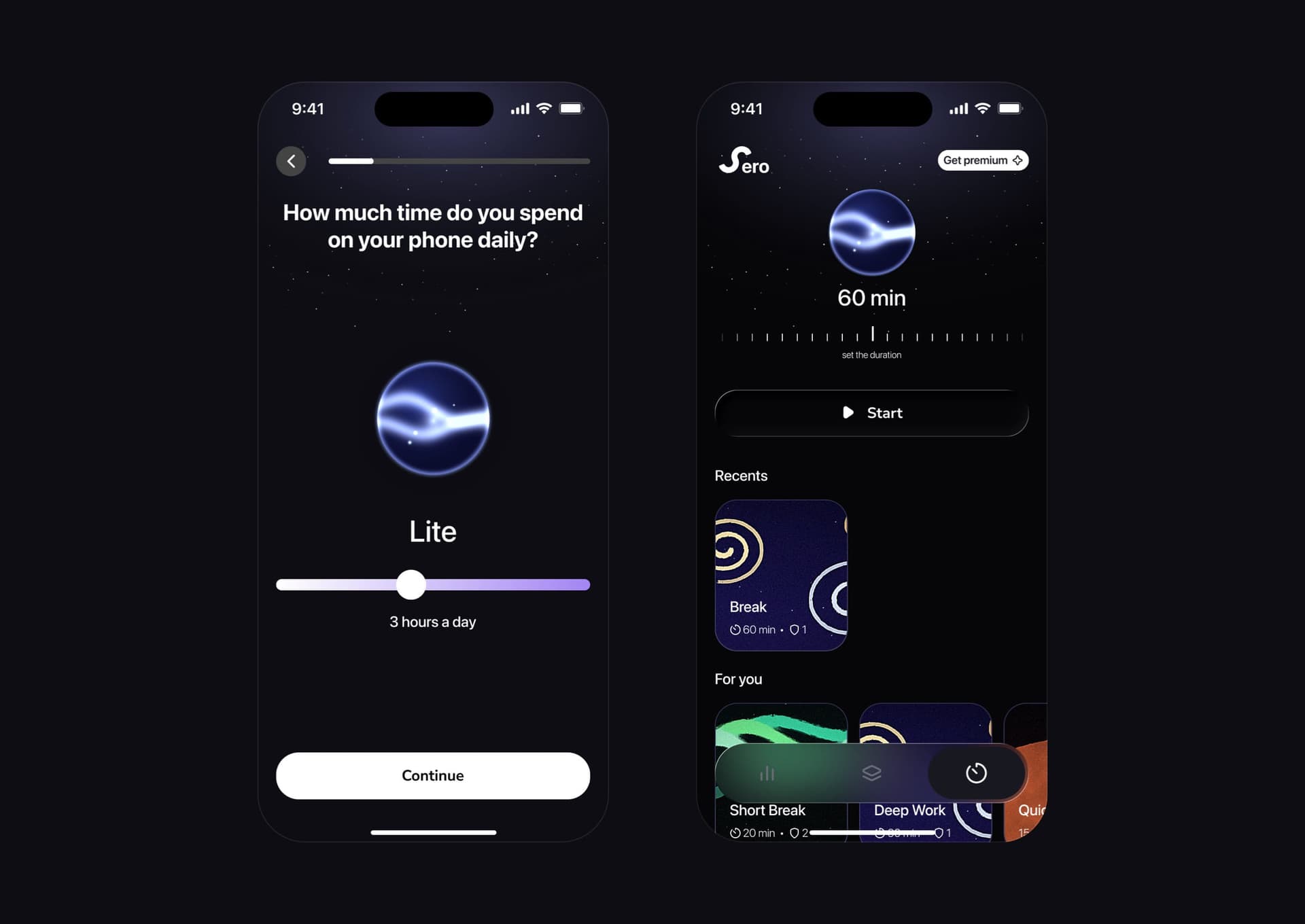
One orb instead of a number
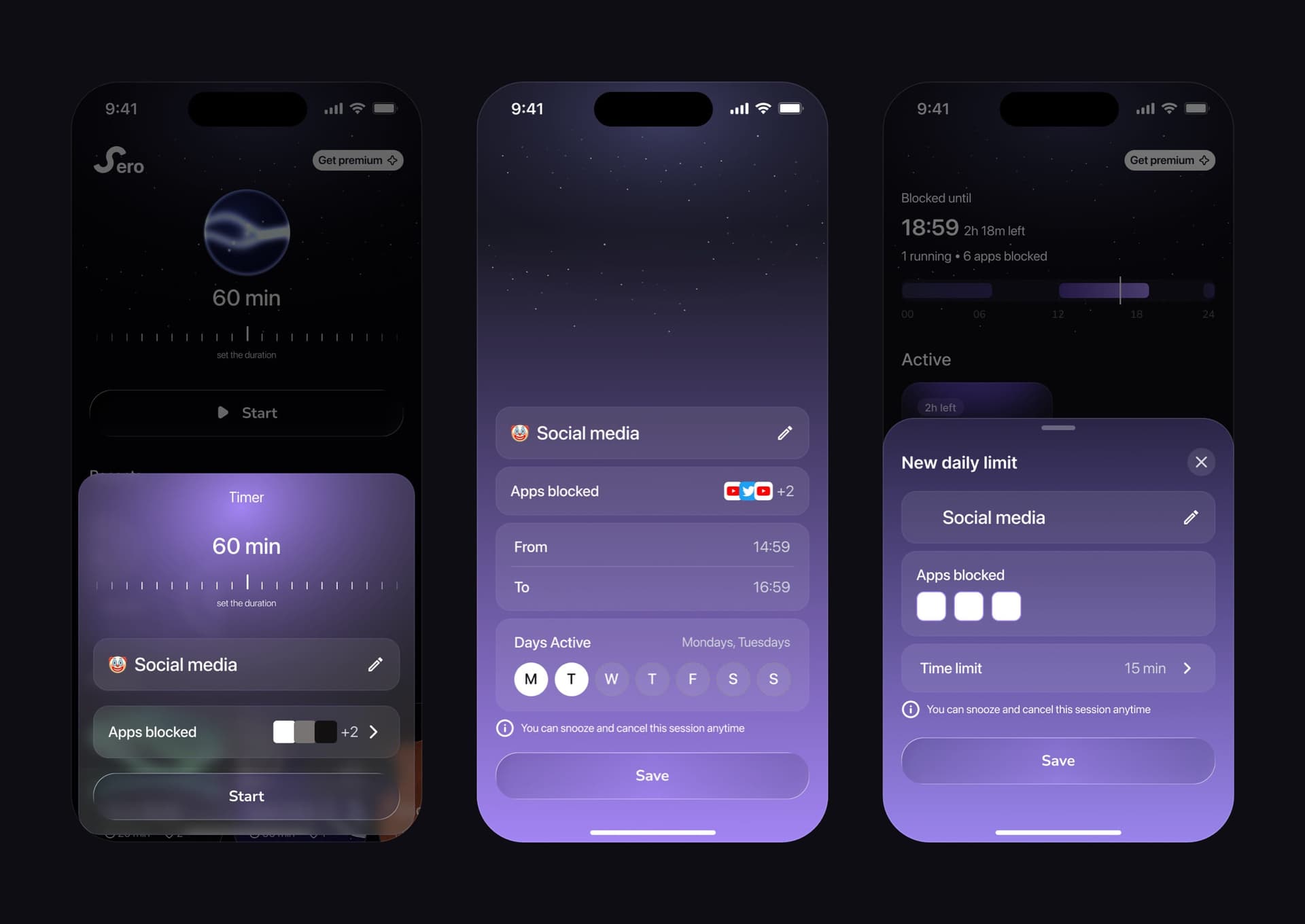
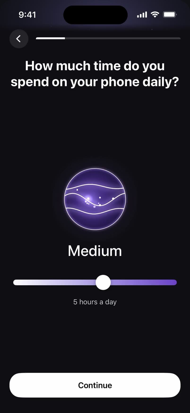
Most of Sero is dark and quiet. The one element that carries feeling is the orb. In onboarding it answers how long you spend on your phone, from Lite to High. On the timer it follows the duration: blue for a short session, purple around an hour and a half, orange for the long ones.
It's the same shape in both places, drawn the same way.
Develop · Onboarding
Every permission comes with its reason
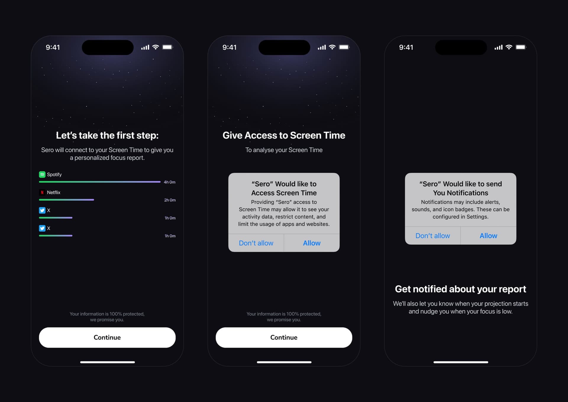
Sero needs Screen Time access, and the iOS dialog doesn't say why. So the screen before it shows what the access is for, a focus report app by app, and the same reason sits above the system dialog. Notifications are asked for last, with theirs: the report, and a nudge when focus slips.
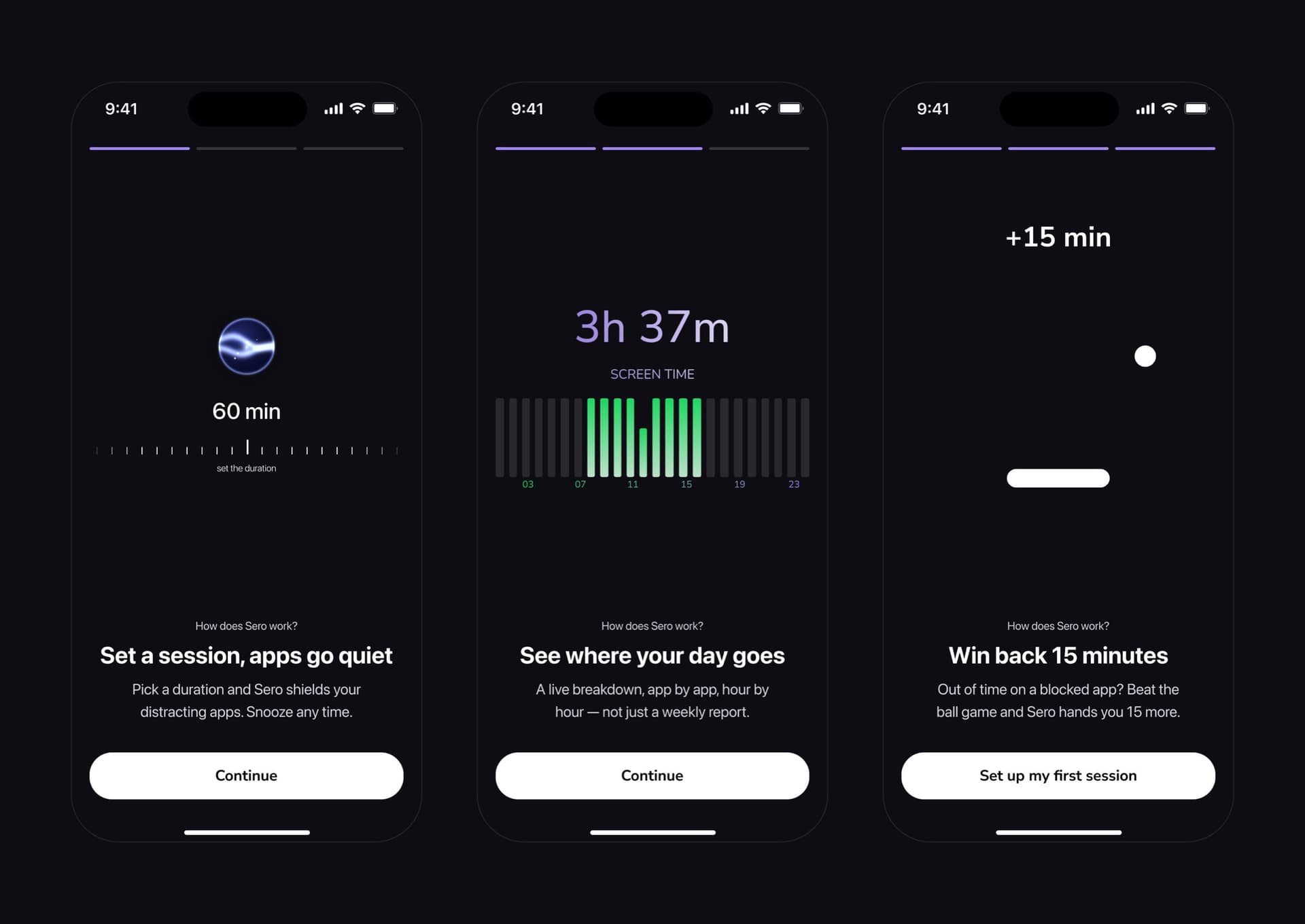
Before the first session, three short screens explain how Sero works, the game included, so the first lock reads as something you agreed to.
Develop · Paywall
The terms are on the page
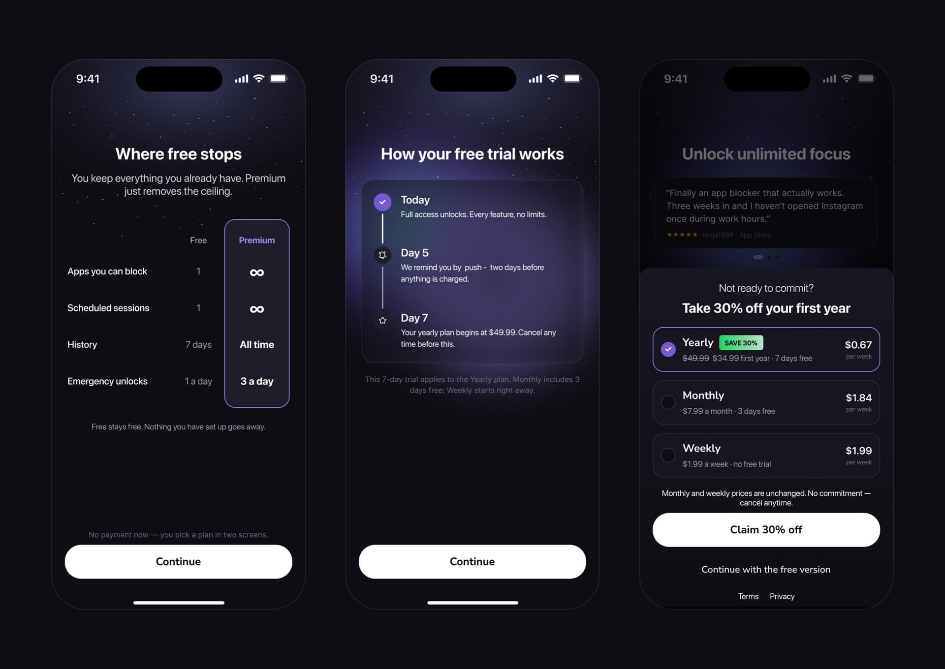
After the price, the paywall shows where the free version stops: one blocked app, one schedule, seven days of history, one emergency unlock a day. Then the trial day by day, with the reminder on day 5 and the charge on day 7. Decline the plans and there's one offer, with "Continue with the free version" right under it.
Develop · Sessions
A block leads with when it ends
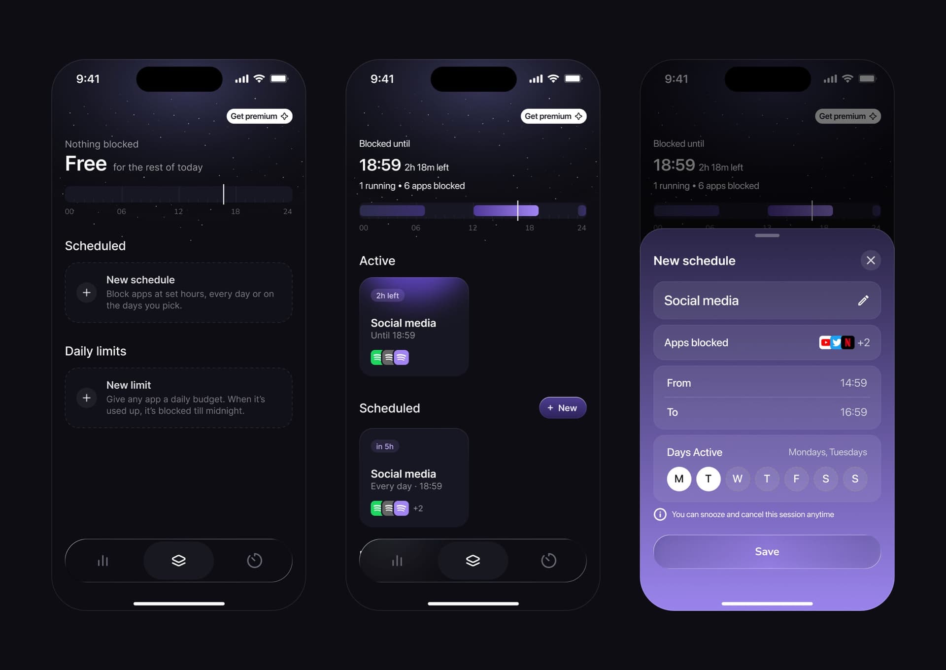
Sessions holds two kinds of block, a schedule and a daily limit. Before anything is set up, both wait as cards with one line each. A running block leads with "Blocked until 18:59" and puts the whole day on one bar. Both sheets share one layout and the same line: you can snooze and cancel this session anytime.
That line is on purpose. On iOS anyone can switch Screen Time access off in Settings, so a block that feels like a trap just gets switched off. The first idea was a hard block with no way out until the scheduled time; benchmarking is what killed it.
Develop · Home
Screen time you can read at a glance
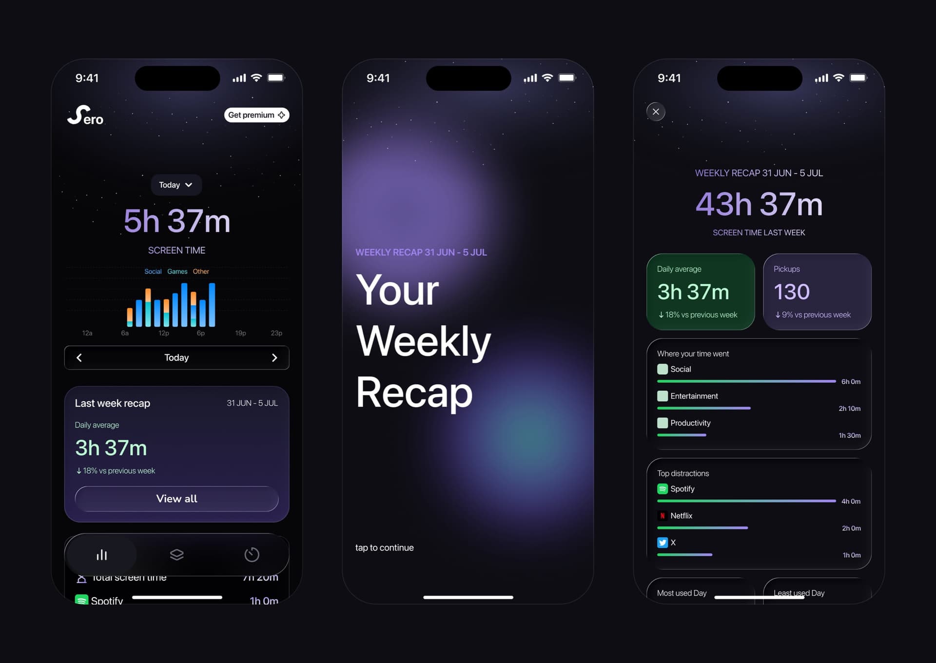
Home is the first tab: today's screen time by the hour, split into social, games and other, last week's recap under it, and time per app. Once a week the recap opens like a story, then becomes one page: daily average, pickups, where the time went, the top distractions and one takeaway, with a button to share it.
Define · Constraints
What iOS wouldn't let us do
I designed the sheets in Liquid Glass first. iOS lets an app use it only in certain places, and our bottom sheets weren't one of them, so every sheet in Sero is a background blur instead.
Screen Time was the other limit. The usage data comes from Apple, and Apple leaves little room to change how it looks, so the screens that show it are designed around what it does allow.
Develop · Adaptive
The same app on a foldable iPhone
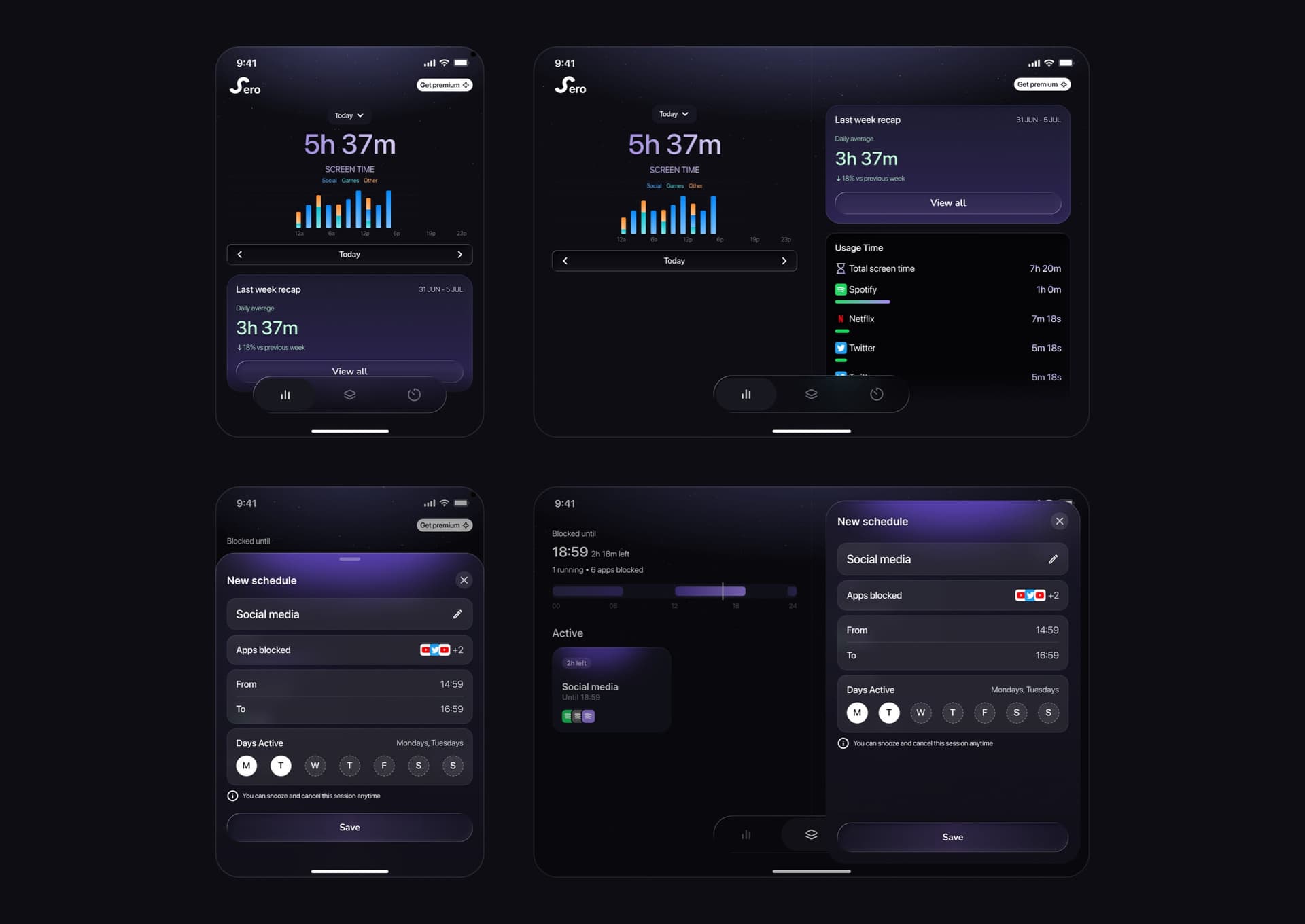
Sero is designed for a regular iPhone first. Home, Sessions and the timer also have a layout for a foldable iPhone, folded and unfolded. Unfolded, sheets open as a panel on the right, so the screen behind them stays in view.
Impact · Reflection
What isn't settled
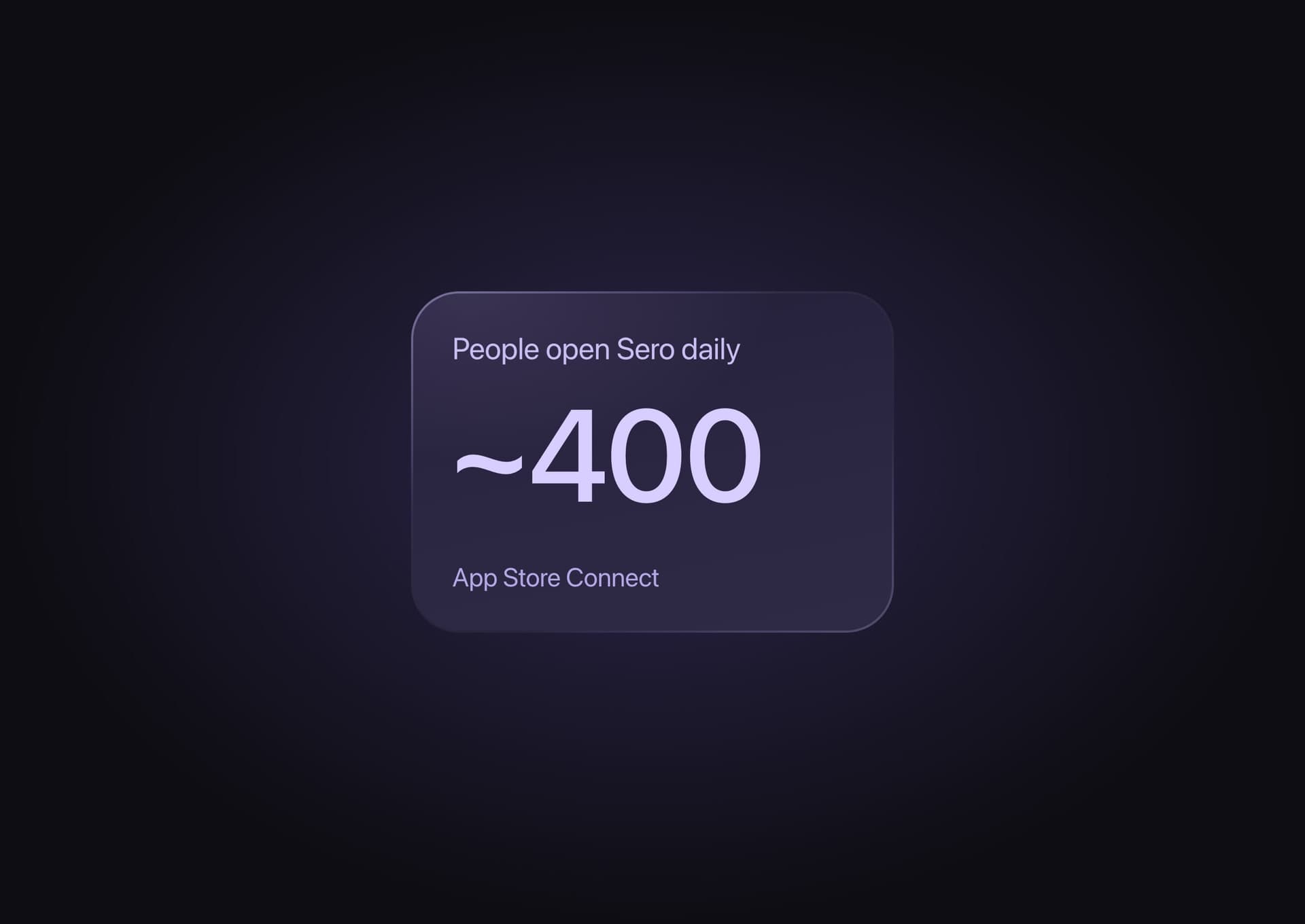
About 400 people open Sero every day. Before launch, about 6 in 10 testers played the game rather than use the emergency unlock, but the sample was small and I haven't measured it since. The open question is the game's difficulty: hard enough to break the reflex, not so much fun that people open it on purpose.
Walkthrough
Sero, screen by screen
35 screens from the App Store build, in the order you meet them. It plays on its own; use the arrows to move.
Onboarding
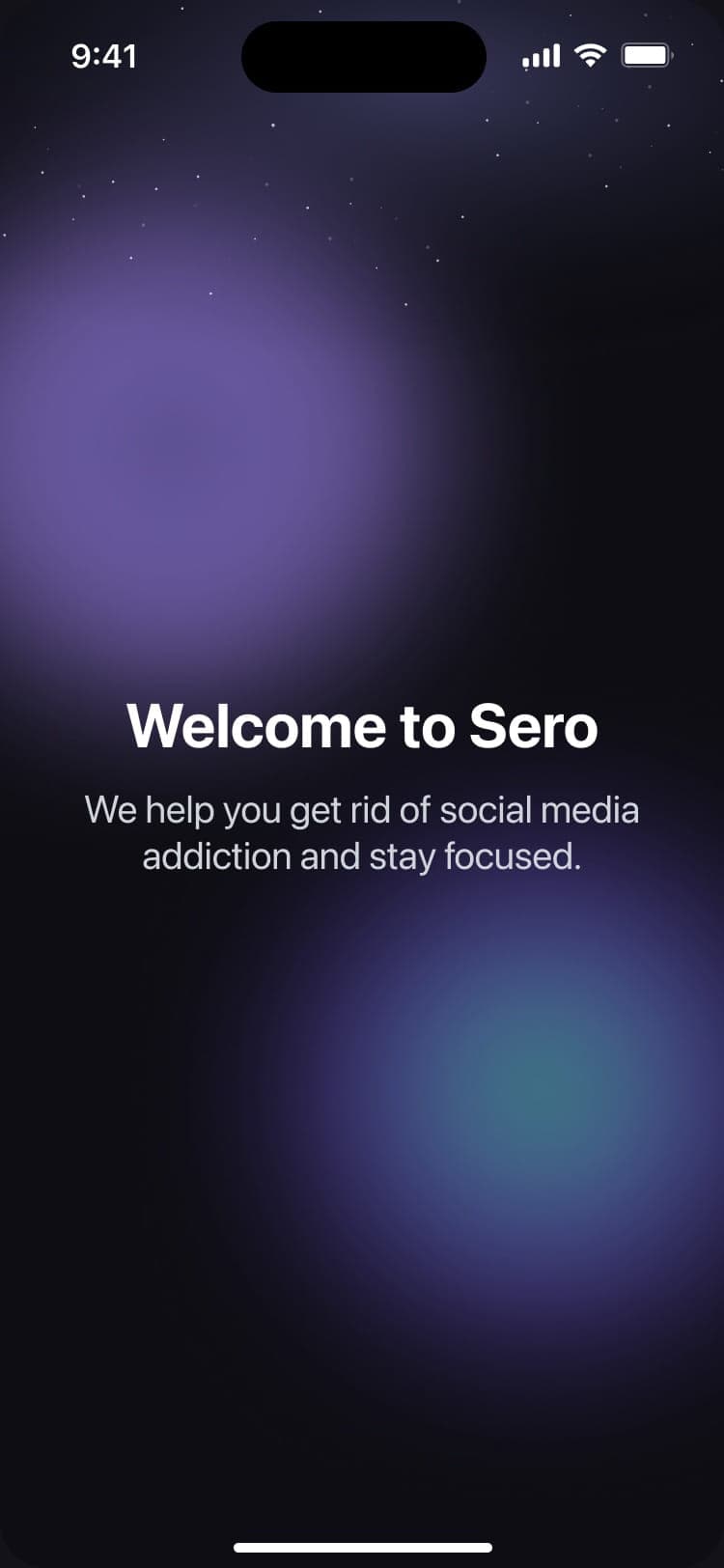
Welcome, and one line on what Sero is for.